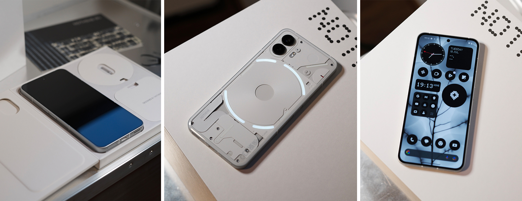
Right smack in the middle of major smartphone launches from OPPO and Samsung, Nothing releases their Phone (2) — an upgraded model of the original Phone (1), with a faster processor, better front-facing camera, bigger battery, faster charging, and a refreshed exterior design that feels really good in the hand, and looks undeniably cool.
We unboxed the phone earlier this week and were impressed by the solid build of the device, and the industrial and futuristic aesthetics that are unique to the Nothing brand.

Above: unboxing the Nothing Phone (2).
The back of the phone stands out. It’s an improved design from Nothing Phone (1), and one of the most sustainable smartphones on the market. The phone is made from 100% recycled aluminium, tin and copper, 80% of plastic parts are made with recycled and bio-based materials, and over 90% of the steel used is from recycled steel. Nothing also claims that no waste from the assembling process ends up in landfills.

Above: The back of the nothing phone (2).
The phone has a 6.7″ flexible LTPO AMOLED display that, to be honest, looks like an iPhone from the front. But in the hand, it feels really different from any other phone; it’s noticeably lighter than other phones with a similar screen size (this weighs 201.2g), and the curved ergonomic back feels comfortable in the hand — it has some grip and isn’t too smooth and slippery.

Above: The front display of the nothing phone (2).
In the box, there’s a USB-C to C charging cable with clear heads that match the transparent design of the phone, plus a SIM tray ejector that resembles a mini bulb. The design for every component is on brand and feels like a solid build.

Above: in the box.
Updates from the phone’s first generation include having an IP54 rating, so it’s now splash, water and dust resistant, and the front camera has been upgraded to a 32MP lens.

Above: the dual rear camera includes a 50mp main + 50MP ultra-wide lens.
Other features include unlocking the phone with face and fingerprint, having 5G capabilities, and one of the most desired features of the phone — embracing a basic, minimalist user interface.

Above: the software is simple yet functional, and unique to nothing phones — plus it’s fully customisable.

Above: the phone starting up.
Nothing’s uniqueness really comes about with the transparent back, where you can see LED strips, and even cooler — these are programmed to light up with notifications and ringtones. It’s the only phone in the market with this futuristic look, and it’s not just about being fancy and extra, these lights are functional too. Nothing calls it the Glyph Interface, and users can assign different light and sound sequences for different contacts and even notifications. So before you even pick up your phone, just by seeing the phone’s LEDs dance on the back, you know who’s calling.

Above: the customisable glyph interface.

Above: the leds light up on the back of the phone. Note — not all are lit in this picture. check out the PRODUCT PAGE to see more.
This phone is really for those who are ahead of the trends, for the first adopters and anyone who likes to challenge the norm. It has all the speed and functionality of a flagship smartphone, but without the bloated software and super high price point (although the Phone (2) has gone up in price from the Phone (1), but it has to considering the upgraded specs all-round).

Best of all, it’s a conversation starter. Everyone will want to see and hold your phone and play with the Glyph Interface. And you’ll be proud to show it off too.
The Nothing Phone (2) is priced from $999 and available for pre-order now at sg.nothing.tech.


You must be logged in to post a comment.